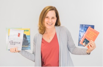
Need some help with book design? Graphic designer Carla Green has her own book designing business, and shares some tips with writers.
By Carla Green
My first jobs out of college were in marketing, and in those roles, I managed to position myself as the liaison with the graphic design firms we used.
I also talked my first boss into getting a Mac — this was in Apple’s early days — and soon became the in-house desktop publishing expert.
So when I starting working for myself in the early 1990s, it was an easy segue to focus on design and page layout.

In Book Design, I Make Sure the Story, Not the Design, Holds the Spotlight
I’ve always especially enjoyed working on publications — newspapers, magazines, manuals, anything with lots of pages. Then I got bit by the book bug when I started working with a film industry publisher to design their trade books in the late 1990s. That relationship led to work with other publishers, and within a few years, self-publishing began to explode, so I was well-poised to service authors directly.
For me, the process of transforming a manuscript into a well-designed book is very rewarding.
And there is significant responsibility in it as well, to understand and embrace the author’s intention, convey it visually, and ensure that the story, not the design, holds the spotlight.
I also really like supporting authors through the publishing process, explaining the options and guiding them step by step. That element is not present in other design projects, like creating a brochure or ad, so focusing on books gives me that extra opportunity to be of service.
In Book Marketing, You Must Have a Clear, Cohesive Message
The importance of a clear, cohesive message probably tops the list for me [of things I learned about marketing].
A cool design might catch someone’s eye, but if they don’t grasp the point of what’s being said, that’s a marketing fail. One of my favorite quotes is by Steve Jobs, who said “Design is not just what it looks like and feels like. Design is how it works.”
For books, that plays out in multiple ways, from a book’s cover design, to its shape and format, to the type choices, to the paper and so on. They should all work together, and they should all support the author’s purpose in writing the book.
Another lesson from my marketing days is the value of attention to detail. All the design in the world isn’t going to help if the date on your event brochure or the phone number on your ad is wrong. And books are a landmine of details, so my penchant for dotting i’s and crossing t’s is right at home when formatting a book.

The First Question I Ask Before Designing a Book Cover
By the time I start designing a book cover, I already know why the author wrote the book and who they wrote it for, because that’s one of the first questions I ask.
Identifying the potential reader keeps me focused on the cover from their perspective. Obviously, I have to create something that resonates with the author, but the cover is ultimately the book’s visual sales pitch, so the reader is really who I am designing for.
As for practical matters, I need the title, subtitle if there is one, and the author’s name. We also discuss whether there may be a testimonial coming that would warrant being on the front cover so I can plan to allow for that.
If the author has existing visuals to incorporate, we go over those as well. And I ask the author to send me several examples of book covers in the same genre that they like and explain why they like them.
When Working on Book Design, I Typically Provide Three Concepts
Ideally, I am also able to review the manuscript, even a work-in-progress version, which really gives me a flavor of the story and starts the creative juices flowing. It’s another way to remember that I am designing for the reader.
Unless we have decided on a text-only cover from the outset, I then start searching for visuals in stock photo and illustration resources. The most obvious concepts generally surface first, but clicking on “similar images” can lead to some intriguing alternatives.
I typically provide three concepts to start and refine from there. We may get to a solution in one or two rounds; other times, it takes multiple iterations. Sometimes I let designs sit for a day before sending to the author and when I come back fresh, a tiny tweak or major adjustment jumps out at me. Design is definitely a process, and I think the best results happen when there is a bit of breathing room for that process.
The Three Things Authors Need to Know When Designing a Book Cover
1. As I said before, the cover is your book’s sale pitch.
That means its job is to entice the reader to want more, not to tell the whole story in a single visual. Strive for clarity of concept — a powerful image beats a cluttered one every time.
2. What you like and what will sell may not be the same thing.
Budgeting for professional cover design is a wise investment in your book’s success. If that’s not an option, spend time looking at other books in your genre that are successful to analyze their strong points, then apply that knowledge to your own cover.
3. Consider the cover at thumbnail size.
Consider what your cover looks like at thumbnail size, because a lot of shopping takes place on smartphones and tablets these days. That reality is another reason to keep the design simple and focused.

Why The Interior Book Design is Important, Too
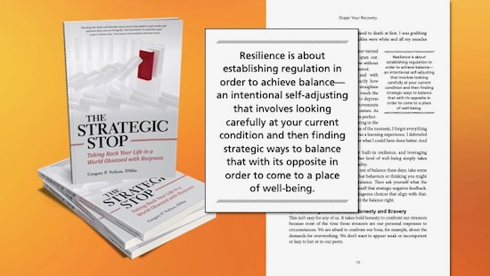
Much of my work is for authors of nonfiction business and self-help books. As a result, the content typically has a hierarchy of information and includes elements beyond the main narrative, such as images, charts, diagrams, sidebars, pull quotes and more.
We want the reader to pick up a book and start reading, right? Well, if they get bogged down by funky fonts or weird spacing, that won’t happen. Professional page design and formatting contribute greatly to a seamless reading experience. In fact, I like to say that my goal is to do my job so well, you don’t notice my work and I’m okay with that.
Visually connecting the cover and interior further enhances the reader’s experience. Perhaps that’s simply a case of using the same or complementary fonts throughout. Maybe some aspect of the cover can be used inside as a decorative element. Will these details sell more books? Probably not in and of themselves, but a positive reading experience can lead to a good review, which can lead to sales.


Mistakes I Made Early On in My Book Design Business
My first really big mistake was partnering with dishonest people.
A painful, expensive lesson which taught me that when people show you who they are, believe them. Fortunately, this is true for good folks as well. I also learned to trust my gut a lot more because of that experience.
Another mistake was not valuing my work enough.
I’ve always put my heart and soul into what I do, so my clients get a ton of value, but early on, I didn’t have the confidence to put an appropriate dollar figure on what I delivered. That translated into putting in long hours with minimal ROI. Not a sustainable business model or lifestyle, for that matter.
I invested in business coaching to shift my money mindset, and my attitude toward money is now much healthier for both me and my business.

Advice for a Young Writer/Artist: Do Whatever You Have to Do to Keep the Fire Burning
Well, first of all, see the previous section and don’t do those things. But seriously, the young person who is my daughter wants to be a writer, so I’ll tell you what I’ve told her.
Do whatever you have to do to keep that fire burning, because combining your passion and purpose will give so much more meaning to your days. Collecting a paycheck may put food on the table, but does it feed your soul?
Look for work that either has room for you to explore your creative interests, or that leaves room outside of work for that exploration.
And second, maintain balance. As an entrepreneur, I live and breathe my business, but I have a life away from the computer as well, and it’s essential to give both the attention they deserve.
Always remember that we do not live to work, we work to live.
* * *
 Carla Green is the founder of Clarity Designworks, where she specializes in designing books and supporting authors through the self-publishing process. Carla has a life-long love of the written word and began her career in marketing positions, often working closely with graphic designers, and ultimately pivoted into that field herself. She became an entrepreneur in the early 1990s, and she found her passion when she added book design to her portfolio in the late 1990s.
Carla relishes making an author’s words come alive on the page, distilling their message into an eye-catching cover and helping them navigate the confusing world of indie publishing. Away from her desk, Carla is barefoot more often than not, has never met an ice cream flavor she didn’t like, and loves planning vacations almost as much as taking them.
For more information about Carla and her work, please see her website and LinkedIn page, or connect with her on Twitter, Facebook, Instagram, and YouTube.
Featured image by Gunnar Ridderström from Pexels.

